
Discovering Actionable Information
User experience research and usability evaluations of websites provide insight into the way clients and customers navigate digital platforms. The following is an example of the type of research Molly performs to identify a website’s audience, create a journey map and task-use analysis, and improve the user’s experience of a website.
Details
Role
Researcher
Test Designer
Usability Test Moderator
Survey Designer
Presenter
Technology
Shopify Analytics
SurveyMonkey
Microsoft Office
UXPressia
Zoom
Canva
The Process
Molly recruited 94 participants via social media completed a questionnaire created in SurveyMonkey to collect ethnographic information about beaders. From the data collected in that survey she created user personas. Survey participants, from novices to experts, participated in user testing to create a Task Analysis diagram. Users were recorded them remotely via Zoom as they progressed through the tasks, describing their choices in a cognitive walk through the website. This helped identify “pain points” and moments of delight or mastry during specific tasks. Time to navigate through the task, number of clicks, frustration points, and moments of flow were used to evaluate the process.

Ethnographic research via survey defined the motivation, behavior, needs, cultural themes, and constraints of people in the beading community.
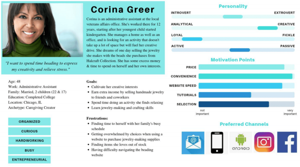
User personas give a face to expert and novice users based on the ethnographic data collected in the user survey.

Cognitive walkthroughs and interviews for empathy were used to gain insight into how users completed tasks “in the wild.” Molly observed participants complete tasks remotely and recorded their click activity via Zoom to gather actionable data for analysis. The number of clicks and time required to complete each task was recorded as well as emotional responses to the process.
Task analysis diagrams show the flow of different customers through the process of completing a tasks.


Journey maps give businesses the opportunity to see, compare, and analyze the users’ emotions, actions, and pathways as they travel through the experience.
Sequence models to show the detailed structure of a specific task and identify user intents and create a user flow that eliminates any wasted steps. This provides a guide to structure the process to match and extend the way users approach a task.

Key Findings
For the first task of searching for a specific item, expert users were much faster and used fewer clicks when locating a particular type of bead on the website than novices. All users experienced frustration with the number of clicks it took to add an item to their cart. Notably, many less experienced users searched by color or material in the sidebar instead of typing into the Search field, which led to longer, less successful searches. New users thought that clicking the “+” symbol beside an item would add the item to their cart; instead it magnified the image of the item being displayed.
The second task was to search and add all of the items needed to make a particular project to the Cart. Expert users were faster to locate items, but they were also more selective about their choice of item, which would often take more time. Novice users who were unfamiliar with beading often placed incorrect items into their cart. The Shopping Cart popup screen that appeared after each item was added to the cart was considered distracting; users found it annoying to close it each time before resuming shopping. Secondly, the numeral indicating the number of items within the cart as users added them did not properly update. This led to user confusion and frustration and often a repetition of their actions to ensure items were in their cart which resulted in more items being added to the cart than were intended.
Many users came across items they would have liked to buy as they were completing the required tasks, but were unable to purchase them because they were sold out. The more often this happened the more frustrated the users became.
Recommendations
Overall, the users needed a way to place things into their carts more quickly with fewer clicks. Users also needed more ways to effectively search the product list.
- Replace the “+” button on the product page with a Cart button so that the user can add the product directly to their cart without navigating away from the product menu.
- Eliminate the pop-up box that displays the contents of the Shopping Cart after each item is added and update the Shopping Cart app so that it shows the current number of items in cart as a small numeral next to the Cart icon in the upper corner of the screen.
- Add a product management app that filters products so that items that are out of stock show up on the final product pages instead of the first product pages that display, creating a product list organized by availability so that users encounter fewer out-of-stock items as they shopped.
